

(UPDATE, 1:02 pm PT: How's this?)
While I'm waiting for "The Producers" star Brad Oscar to call for our interview for this week's episode of "The Strip," I noticed that the writer of the Res Ipsa Poker blog reacted to my befuddlement in Sunday's post on why people watch live poker. He finds watching live poker utterly thrilling and blames my disinterest on my being a "media type." Fine. I asked for that.
But his post's headline is: "Holy Unreadable Color Combinations Batman" and near the end he writes: "I would say click through and read it for yourself but be warned you might go temporarily blind."
So I ask. Are these colors unreadable? If so, of course I want to fix that. And, God bless Blogger, it's pretty darn easy to do. So speak up! And, of course, join the live chat and hear the unedited show as we record it at 7 pm PT tonight at LVRocks.Com.
skip to main |
skip to sidebar


* * *
ABOUT US

- THE STRIP PODCAST
- Las Vegas, United States
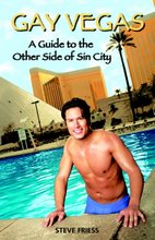
- Steve Friess is a 2011-12 recipient of the prestigious Knight-Wallace Fellowship at the University of Michigan, where he will be studying the impact of the rapid expansion of Vegas-style gaming on Asia. He's a podcaster, author and Vegas-based freelance journalist who writes regularly for USA Today, The New York Times, Newsweek and many others. His column, "The Strip Sense" appears every Thursday in the Las Vegas Weekly. His books include "Gay Vegas" from Huntington Press and Knopf Mapguides' "Las Vegas."
Friess co-hosts the weekly celebrity interview podcast The Strip Podcast "The Strip" with his husband, Miles Smith, the executive producer at KSNV-TV, Channel 3. For four years, Steve also co-hosted The Petcast with Las Vegas Sun education scribe Emily Richmond.
Twitter Updates
* * *
The roulette is an ideal game for newbies! You can play the game at the jeux de machine à sous on the playunited.com website!
* * *
The easiest way to make more money at poker is to play against easier competition. BestPokerSites.org has rated all of the easiest poker sites so you can find the fishiest players (and take all of their money). Check out the article today.
* * *
Grand Vegas Casino
Las Vegas Show Tickets
Las Vegas Show Tickets
VegasTickets.Com has tickets available to all Vegas Shows and Vegas Concerts. Check them out for great deals and savings!
RECENT COMMENTS
FYI: I reject very few comments, but unfair anonymous attacks w/info I know to be untrue won't be posted. -sf
The Podcast
Each week, we bring you news, conversations with Vegas notables, trivia and tourist tips on The Strip Podcast. Listen through this nifty player (above) or by subscribing in iTunes.
* * *
Please consider donating to keep the podcast and blog going. $25 or more gets you a prize off the prize list in the left rail of TheStripPodcast.Com.
What's my beef with the R-J? Read this
Subscribe to "The Strip" Podcast in iTunes

Playing casino games at the Las Vegas is loads of fun and might even be profitable. However these days you can also play casino games such as Caribbean stud poker online.
Tags
THE STRIP FINALE
Below are links to the final episodes and last week of special editions of The Strip Podcast. Right-click on any of these to save and hear at your leisure. Otherwise, click on them and they should play. Enjoy, and thanks for the wonderful years.
Aug. 27: Steve's Valedictory Speech To Lambda
Aug. 26: Steve on LVW Radio Mag Regarding Jockey Club
Aug. 24: Steve on KNPR on the future of Vegas newspapers
Aug.23: Steve's KNPR Exit Interview
Aug. 22: Steve on KNPR on Eureka, NV
Sept. 7: The Finale
Special Reissue: The First Episode from 9/1/05
Aug. 27: Steve's Valedictory Speech To Lambda
Aug. 26: Steve on LVW Radio Mag Regarding Jockey Club
Aug. 24: Steve on KNPR on the future of Vegas newspapers
Aug.23: Steve's KNPR Exit Interview
Aug. 22: Steve on KNPR on Eureka, NV
* * *
Looking to learn how to play poker online? You can't go wrong checking out this site! It's lots of fun!
* * *
play casino games at home Las Vegas-style only on Slotsofvegas.com
CONTACTS
TheStripPodcast [at] aol.com

Show: TheStripPodcast.Com
(702) 997-3300
Facebook: Steve Friess
Twitter: @TheStripPodcast
* * *
Interested in playing at an online casino?
If so be sure to swing by OnlineCasinoTopic.com where you'll find a great selection of some of the webs best most trusted casinos online.
Freelancer Blogs
- Awkward Journalist (Travel Photography)
- Bohemian Adventures (Travel/Personal)
- Broke Parents
- Como el Pulpo (Argentina)
- Current Mom
- Intellectual Refuge (Literary Journal)
- Kim Tracey Prince (Essays)
- Musical Shapes (Pop Culture)
- One Sentence Beer Review
- Painperdu (New Orleans)
- Panic Book (Misc/Personal)
- Piper Hoffman (Law, Culture)
- Reel Life With Jane (Film)
- State College Mom
- The Humor Columnist
- The Turkish Life (Turkey)
- Tiffany Hawk (travel)
- WanderMelon (Travel)
- Word Snooper (Language)
* * *
GamblingChoice.Com is the global leader in online gambling guides including the best online casino, poker and sports betting.
* * *
Prism Casino brings the best online
casino experience on the web. Play at one of the most trusted casino
online

--BUY STEVE'S BOOK!--
My favorite sites
- Comic Curmudgeon
- CSN Capitol Club Blog
- Dave Mckee's Stiffs & Georges
- FOOBiverse's Journal
- Gold Plated Door
- Grits to Glitz Podcast
- Las Vegas Advisor
- Nat'l Lesbian & Gay Journalists Assn
- Nevada Outdoors News
- Norm!'s Vegas Confidential
- PopSurfing Blog
- Privacy Clue
- Strip Sense Columns
- TicketNews.Com Rankings
- Two Way Hard Three Blog
- Vegas Mavens
- Vegas Tripping
- Wockner Blog
Blog Archive
-
►
2011
(200)
- ► 09/11 - 09/18 (2)
- ► 09/04 - 09/11 (5)
- ► 08/28 - 09/04 (3)
- ► 08/21 - 08/28 (2)
- ► 08/14 - 08/21 (5)
- ► 08/07 - 08/14 (6)
- ► 07/31 - 08/07 (7)
- ► 07/24 - 07/31 (7)
- ► 07/17 - 07/24 (7)
- ► 07/10 - 07/17 (4)
- ► 07/03 - 07/10 (2)
- ► 06/26 - 07/03 (9)
- ► 06/19 - 06/26 (7)
- ► 06/12 - 06/19 (4)
- ► 06/05 - 06/12 (3)
- ► 05/29 - 06/05 (2)
- ► 05/22 - 05/29 (5)
- ► 05/15 - 05/22 (7)
- ► 05/08 - 05/15 (3)
- ► 05/01 - 05/08 (6)
- ► 04/24 - 05/01 (8)
- ► 04/17 - 04/24 (4)
- ► 04/10 - 04/17 (6)
- ► 04/03 - 04/10 (8)
- ► 03/27 - 04/03 (6)
- ► 03/20 - 03/27 (4)
- ► 03/13 - 03/20 (5)
- ► 03/06 - 03/13 (7)
- ► 02/27 - 03/06 (4)
- ► 02/20 - 02/27 (4)
- ► 02/13 - 02/20 (7)
- ► 02/06 - 02/13 (8)
- ► 01/30 - 02/06 (4)
- ► 01/23 - 01/30 (7)
- ► 01/16 - 01/23 (7)
- ► 01/09 - 01/16 (4)
- ► 01/02 - 01/09 (11)
-
►
2010
(393)
- ► 12/26 - 01/02 (8)
- ► 12/19 - 12/26 (7)
- ► 12/12 - 12/19 (7)
- ► 12/05 - 12/12 (6)
- ► 11/28 - 12/05 (10)
- ► 11/21 - 11/28 (4)
- ► 11/14 - 11/21 (9)
- ► 11/07 - 11/14 (11)
- ► 10/31 - 11/07 (8)
- ► 10/24 - 10/31 (9)
- ► 10/17 - 10/24 (7)
- ► 10/10 - 10/17 (13)
- ► 10/03 - 10/10 (11)
- ► 09/26 - 10/03 (12)
- ► 09/19 - 09/26 (8)
- ► 09/12 - 09/19 (7)
- ► 09/05 - 09/12 (8)
- ► 08/29 - 09/05 (7)
- ► 08/22 - 08/29 (8)
- ► 08/15 - 08/22 (6)
- ► 08/08 - 08/15 (6)
- ► 08/01 - 08/08 (7)
- ► 07/25 - 08/01 (7)
- ► 07/18 - 07/25 (5)
- ► 07/11 - 07/18 (5)
- ► 07/04 - 07/11 (9)
- ► 06/27 - 07/04 (7)
- ► 06/20 - 06/27 (4)
- ► 06/13 - 06/20 (4)
- ► 06/06 - 06/13 (8)
- ► 05/30 - 06/06 (12)
- ► 05/23 - 05/30 (10)
- ► 05/16 - 05/23 (8)
- ► 05/09 - 05/16 (6)
- ► 05/02 - 05/09 (6)
- ► 04/25 - 05/02 (6)
- ► 04/18 - 04/25 (7)
- ► 04/11 - 04/18 (6)
- ► 04/04 - 04/11 (9)
- ► 03/28 - 04/04 (5)
- ► 03/21 - 03/28 (8)
- ► 03/14 - 03/21 (8)
- ► 03/07 - 03/14 (4)
- ► 02/28 - 03/07 (5)
- ► 02/21 - 02/28 (16)
- ► 02/14 - 02/21 (11)
- ► 02/07 - 02/14 (8)
- ► 01/31 - 02/07 (11)
- ► 01/24 - 01/31 (9)
- ► 01/17 - 01/24 (4)
- ► 01/10 - 01/17 (2)
- ► 01/03 - 01/10 (4)
-
►
2009
(477)
- ► 12/27 - 01/03 (8)
- ► 12/20 - 12/27 (7)
- ► 12/13 - 12/20 (6)
- ► 12/06 - 12/13 (7)
- ► 11/29 - 12/06 (11)
- ► 11/22 - 11/29 (3)
- ► 11/15 - 11/22 (5)
- ► 11/08 - 11/15 (9)
- ► 11/01 - 11/08 (9)
- ► 10/25 - 11/01 (5)
- ► 10/18 - 10/25 (7)
- ► 10/11 - 10/18 (4)
- ► 10/04 - 10/11 (12)
- ► 09/27 - 10/04 (6)
- ► 09/20 - 09/27 (5)
- ► 09/13 - 09/20 (11)
- ► 09/06 - 09/13 (6)
- ► 08/30 - 09/06 (15)
- ► 08/23 - 08/30 (8)
- ► 08/16 - 08/23 (8)
- ► 08/09 - 08/16 (5)
- ► 08/02 - 08/09 (8)
- ► 07/26 - 08/02 (7)
- ► 07/19 - 07/26 (8)
- ► 07/12 - 07/19 (8)
- ► 07/05 - 07/12 (9)
- ► 06/28 - 07/05 (6)
- ► 06/21 - 06/28 (8)
- ► 06/14 - 06/21 (9)
- ► 06/07 - 06/14 (8)
- ► 05/31 - 06/07 (7)
- ► 05/24 - 05/31 (14)
- ► 05/17 - 05/24 (15)
- ► 05/10 - 05/17 (8)
- ► 05/03 - 05/10 (10)
- ► 04/26 - 05/03 (17)
- ► 04/19 - 04/26 (15)
- ► 04/12 - 04/19 (6)
- ► 04/05 - 04/12 (9)
- ► 03/29 - 04/05 (9)
- ► 03/22 - 03/29 (19)
- ► 03/15 - 03/22 (9)
- ► 03/08 - 03/15 (13)
- ► 03/01 - 03/08 (18)
- ► 02/22 - 03/01 (10)
- ► 02/15 - 02/22 (8)
- ► 02/08 - 02/15 (14)
- ► 02/01 - 02/08 (8)
- ► 01/25 - 02/01 (11)
- ► 01/18 - 01/25 (6)
- ► 01/11 - 01/18 (7)
- ► 01/04 - 01/11 (16)
-
►
2008
(481)
- ► 12/28 - 01/04 (8)
- ► 12/21 - 12/28 (6)
- ► 12/14 - 12/21 (11)
- ► 12/07 - 12/14 (4)
- ► 11/30 - 12/07 (11)
- ► 11/23 - 11/30 (8)
- ► 11/16 - 11/23 (12)
- ► 11/09 - 11/16 (7)
- ► 11/02 - 11/09 (11)
- ► 10/26 - 11/02 (11)
- ► 10/19 - 10/26 (13)
- ► 10/12 - 10/19 (6)
- ► 10/05 - 10/12 (5)
- ► 09/28 - 10/05 (13)
- ► 09/21 - 09/28 (16)
- ► 09/14 - 09/21 (8)
- ► 09/07 - 09/14 (14)
- ► 08/31 - 09/07 (13)
- ► 08/24 - 08/31 (8)
- ► 08/17 - 08/24 (9)
- ► 08/10 - 08/17 (12)
- ► 08/03 - 08/10 (10)
- ► 07/27 - 08/03 (11)
- ► 07/20 - 07/27 (6)
- ► 07/13 - 07/20 (8)
- ► 07/06 - 07/13 (13)
- ► 06/29 - 07/06 (10)
- ► 06/22 - 06/29 (10)
- ► 06/15 - 06/22 (11)
- ► 06/08 - 06/15 (5)
- ► 06/01 - 06/08 (6)
- ► 05/25 - 06/01 (10)
- ► 05/18 - 05/25 (10)
- ► 05/11 - 05/18 (7)
- ► 05/04 - 05/11 (16)
- ► 04/27 - 05/04 (12)
- ► 04/20 - 04/27 (12)
- ► 04/13 - 04/20 (13)
- ► 04/06 - 04/13 (8)
- ► 03/30 - 04/06 (4)
- ► 03/23 - 03/30 (6)
- ► 03/16 - 03/23 (9)
- ► 03/09 - 03/16 (8)
- ► 03/02 - 03/09 (12)
- ► 02/24 - 03/02 (9)
- ► 02/17 - 02/24 (6)
- ► 02/10 - 02/17 (7)
- ► 02/03 - 02/10 (4)
- ► 01/27 - 02/03 (9)
- ► 01/20 - 01/27 (3)
- ► 01/13 - 01/20 (11)
- ► 01/06 - 01/13 (9)
-
▼
2007
(424)
- ► 12/30 - 01/06 (13)
- ► 12/23 - 12/30 (6)
- ► 12/16 - 12/23 (2)
- ► 12/09 - 12/16 (6)
- ► 12/02 - 12/09 (8)
- ► 11/25 - 12/02 (14)
- ► 11/18 - 11/25 (9)
- ► 11/11 - 11/18 (14)
- ► 11/04 - 11/11 (12)
- ► 10/28 - 11/04 (13)
- ► 10/21 - 10/28 (15)
- ► 10/14 - 10/21 (10)
- ► 10/07 - 10/14 (7)
- ► 09/30 - 10/07 (7)
- ► 09/23 - 09/30 (9)
- ► 09/16 - 09/23 (6)
- ► 09/09 - 09/16 (9)
- ► 09/02 - 09/09 (16)
- ► 08/26 - 09/02 (9)
- ► 08/19 - 08/26 (11)
- ► 08/12 - 08/19 (5)
- ► 08/05 - 08/12 (13)
- ► 07/29 - 08/05 (7)
- ► 07/22 - 07/29 (5)
- ► 07/15 - 07/22 (12)
- ► 07/08 - 07/15 (5)
- ► 07/01 - 07/08 (9)
- ► 06/24 - 07/01 (4)
- ► 06/17 - 06/24 (7)
- ► 06/10 - 06/17 (8)
- ► 06/03 - 06/10 (12)
- ► 05/27 - 06/03 (10)
- ► 05/20 - 05/27 (10)
- ► 05/13 - 05/20 (12)
- ► 05/06 - 05/13 (13)
-
▼
04/29 - 05/06
(15)
- BREAKING: MGM Mirage Sportsbook Outage
- Steve Wyrick responds
- Don't worry, deafie, it's REALLY loud
- Let the Bette puns begin
- Before Bette, how about a Dunkin' Donut?
- More EXCLUSIVE Bette Midler Details!
- Vegas, Disabilities and the Hard of Hearing (Like ...
- CONFIRMED! BETTE MIDLER TO REPLACE CELINE
- Sinatra by a nose!
- Is this unreadable?
- The Moron Strikes Again
- This week on "The Strip"
- Exclusive: Edwards Trashes Richardson At Private F...
- We're In The Sun!
- Vegas' Most Boring Spectator Sport
- ► 04/22 - 04/29 (10)
- ► 04/15 - 04/22 (10)
- ► 04/08 - 04/15 (14)
- ► 04/01 - 04/08 (10)
- ► 03/25 - 04/01 (12)
- ► 03/18 - 03/25 (10)
- ► 03/11 - 03/18 (13)
- ► 03/04 - 03/11 (2)
8 comments:
Fine white type on a red background is a little tough on the eyes, but I wouldn't call it unreadable. I prefer dark type on a light background.
Tell Brad I said he's fabulous. I just realized he's been in every production of The Producers that I've seen, including his cameo as a taxi driver in the movie. Love him!
I wouldn't say that I find watching live poker thrilling. In fact, my exact words were: "Some media types say watching live poker is incredibly boring. ** You know what? They might be right."
Not the most dynamic lead, I'll give you that.
Anyway, to address the color question, yes in my opinion it's "unreadable". Literally in the case of the undertitle - I can make out the words "Vegas-centric weekly celebrity interview program" but nothing else without highlighting it. In the case of the rest it's only figuratively unreadable - I find the light text on a red background rather hard on the eyes and again end up selecting the text to make it more clear. Links are also in a color that's hard to read.
Anyway, it's a blog, make it whatever color you want. Looking forward to checking out your podcast.
-- that guy from the Res Ipsa Poker blog
... three minutes later:
Much better!
I was confused, but you've already changed the colours I think.
You title bar is in an all caps Sans-serif font, and is hard to read. I can't scan it.
OK...I'm your monkey. How's that for the font? Does the blue background work? Anyone want to suggest another color? The red I liked because it was ominous and dangerous, much like the city. But that's no use if nobody can read it. I wonder why nobody mentioned it before...
Much better. I'm subscribed now.
how do you subscribe?
The blue background is better. the red's still not that easy to read but I can.
One of the reasons I never mentioned it before is that I have pretty old technology and normally figure that any colour problems I have are because of my crappy old monitors.
You DO have to be aware when making colour choices that what you see will often not be what your readers see as their technology might not be as snazzy as yours :)
Post a Comment