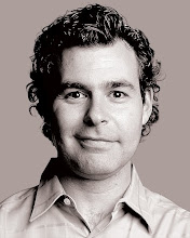
 I had some sort of bizarre problem with TheStripPodcast.Com just as Amy and I were heading off to Utah to take in some not-Shakespeare at the Utah Shakespeare Festival, so for the moment, the bare minimum is on the site. But I did manage to post the proper episode of The Strip with Roger Thomas as well as a narrated video slideshow of the tour I took of Wynn Design & Development last week.
There's lots of goodies in both, and you can hear by clicking on the links I just provided or save the files by right-clicking to watch/hear later.
Among those goodies, the real headline was Roger's reaction to the earlier leaked photos of the Bellagio room redesign that were posted on VegasTripping.Com. In the past, neither Roger nor Steve Wynn have been willing to critique the design stewardship of their first masterpiece resort, so I sent Thomas the VT pix with the identifying information cut off. I hoped Roger would say, "Holy crud, what is THAT?" but instead he recognized some of the architectural elements that he created for those rooms.
Then he critiqued them anyway. Here's the exchange:
Friess: I think a lot of people when they look at that are really surprised that that is Bellagio.
Roger: I’m not. I think it’s consistent with the design that their management always seems to pursue. It’s almost as if they haven’t noticed that they’re in Bellagio. When you're in a guest room, you can pretty much get away with that. I like our guest rooms to be a natural progression and part of the whole. If you can get away with ignoring where you are in a hotel, you can usually get away with that in a guest room. I don’t think they’ve done that as successfully at Bellagio with the buffet and with several of the restaurants that are kind of a slap in the face of the space they’re in. They don’t feel terribly well integrated to me. [But] when you go through a small door to enter a space, what's within can be a greater change than a very wide opening to another space.
Friess: When you look at these pictures, the Bellagio was such a personal project for you. Does it not rankle you to see what they've done with it?
Roger: No. I get to wake up every morning and make my dreams come true. If someone decides they have a better idea, I just let it go. I'm so busy and focused on creating new and better environments for Wynn Resorts, frankly if someone changes things and I'm not really a fan of what they've done, i just look at it as they've made themselves easier for me to compete with.
Friess: Boy, you're catty this morning.
Roger: It's not catty. Actually, having said that, I think there are some very comfortable things about this room. I notice for one thing that they're now using an intelligent service for the snack service that looks exactly like the way we designed ours with the stepped up presentation. And there are a lot of things, they've got a patterned sheer over a blackout which is, you know, something we started doing. I think there are a lot of things about this room that look very considerate and like they're very aware of what the guests needs. ... I haven't sensed the room 360-degrees, but it looks like they approached it in a fairly sensitive way and that there's good consistency in many of the design decisions that they made in terms of design style. Would I have made any of those decisions? Probably not, but that's besides the point.
Friess: You made the comment about the Buffet, and I haven't been in the buffet in quite a long time. They've redesigned it since you folks left?
Roger: They did, and the facade of it is kind of an extreme mismatch for the environment which surrounds it. I think that's intentional. I just don't think it was successful.
There's plenty more, including Roger's praise of Chuck from VegasTripping and the revelation that Jerry Beale, the designer brought in to replace Roger when Roger was supposed to leave the company, has departed for Los Angeles. So check out all the fun stuff.
P.S. I'm going to wait until after this Utah trip to get the 3-minute narrated slideshow up in which Roger explains the artistic significance and intricacies of the $12.8 million vases the company recently bought.


0 comments:
Post a Comment